Periodic®
Naming, brand identity, packaging and art direction for a single-ingredient supplement brand.
Periodic® is a packaging project by Rohan Kumar, brand designer in India, from 2026, covering packaging, naming, brand identity.
- Field: Packaging
- Year: 2026
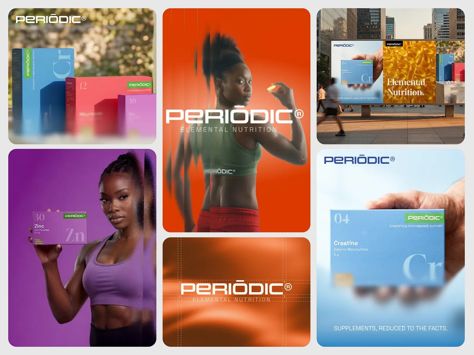
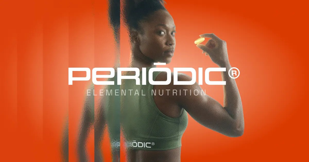
PERIODIC®
Periodic is a single-ingredient supplement brand. Every product is one compound at a clinically studied dose. It is made for people who read labels and want to know exactly what they are taking.
Scope: Naming · Brand identity · Packaging system · Art direction
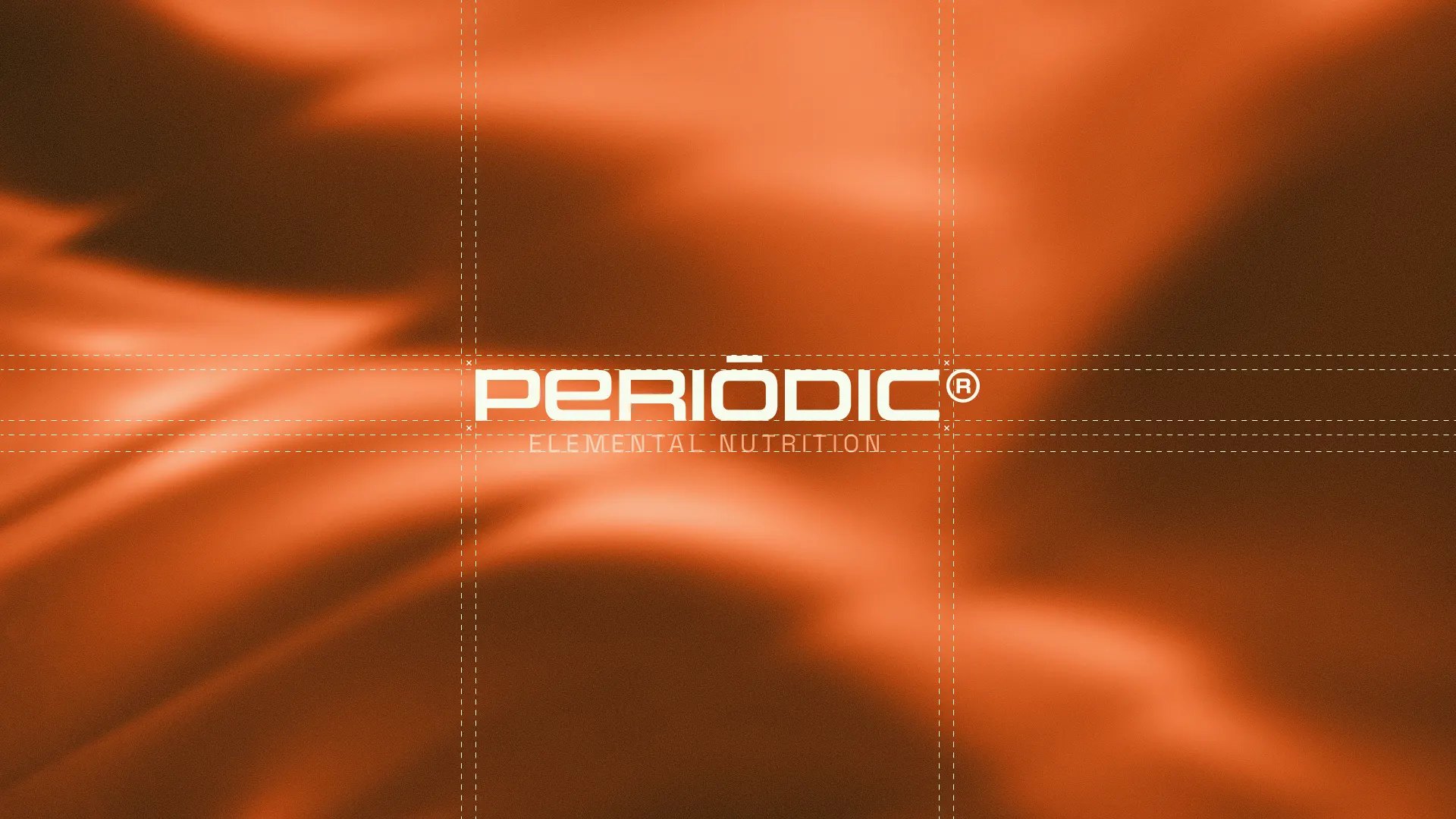
The challenge
Simple products get ignored on the shelf.
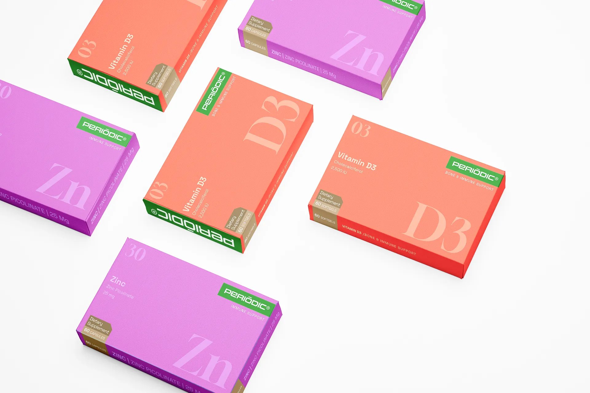
Single-ingredient supplements are a growing category, but most of them ship in plain white boxes that disappear next to louder brands. Periodic needed packaging that makes one ingredient look like a deliberate choice, not a budget one.
The Idea
Use the element tile.
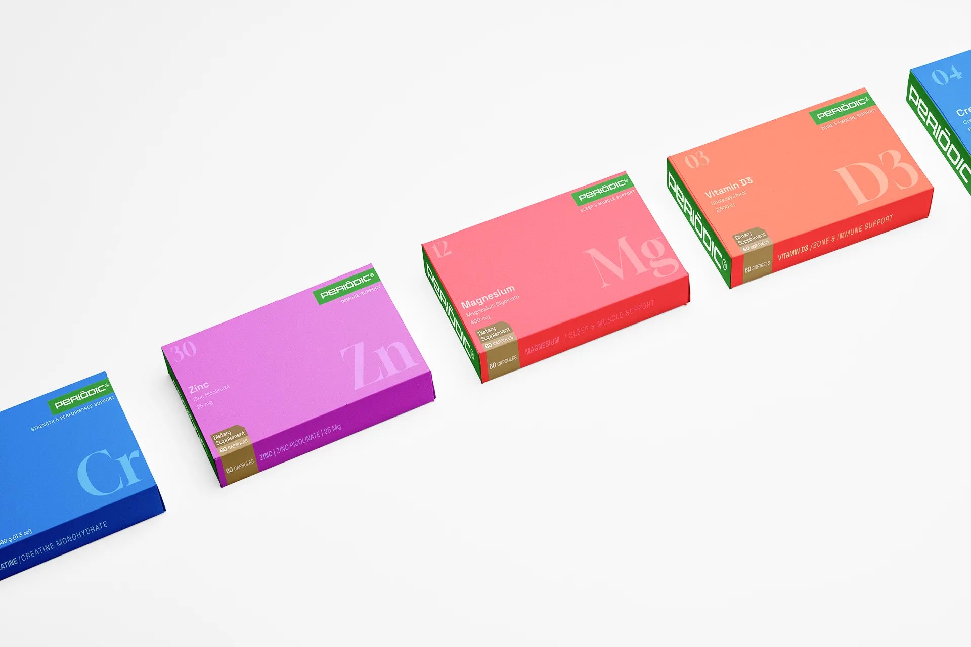
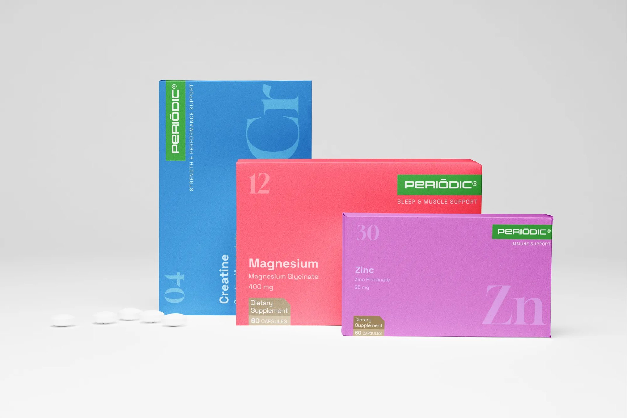
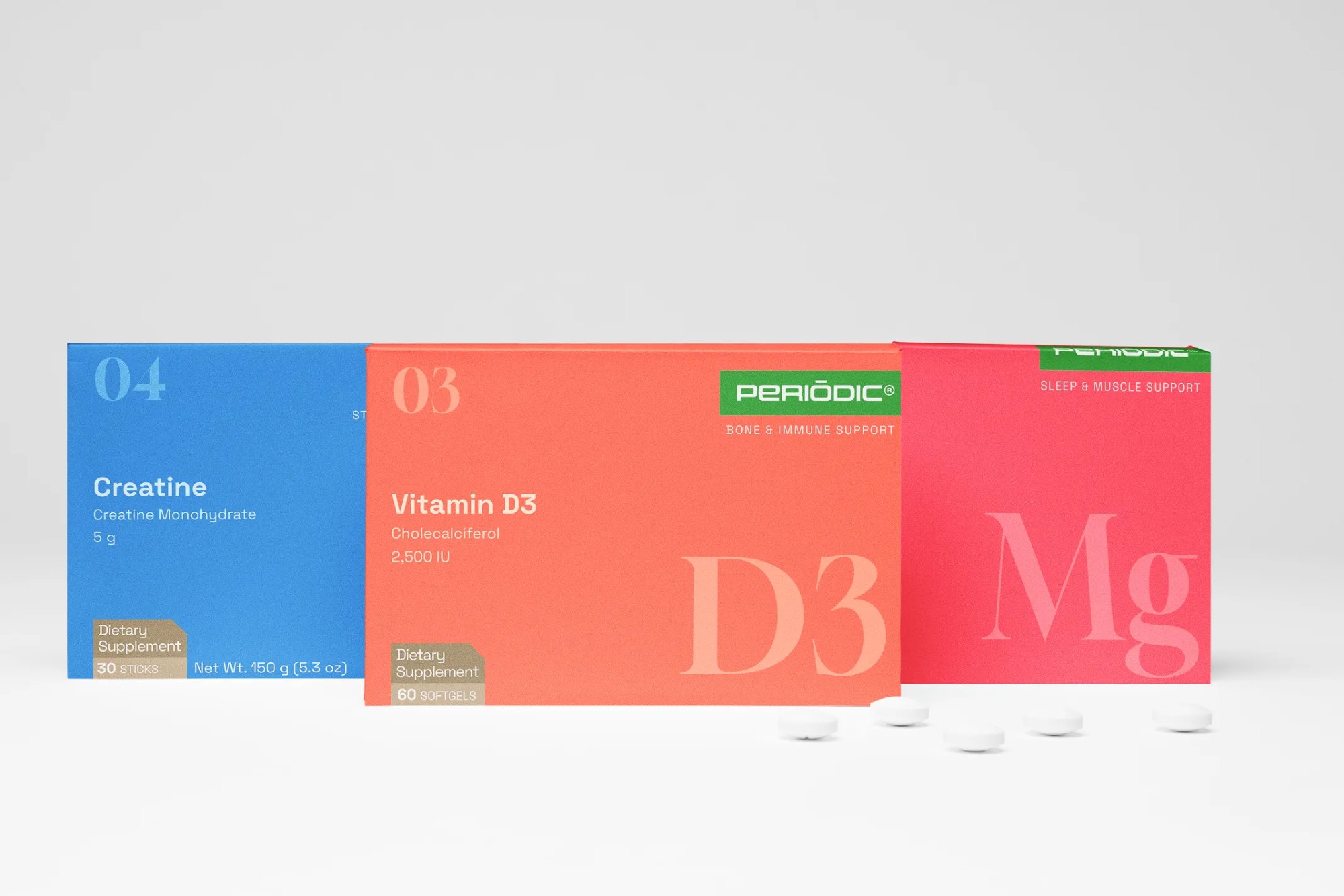
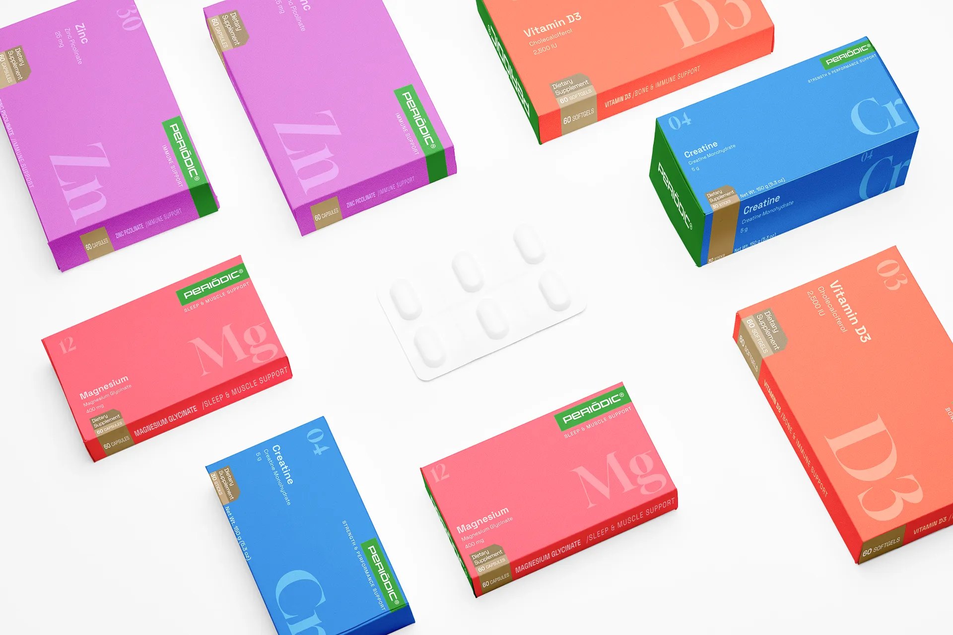
Every Periodic product is one ingredient at a studied dose. That is exactly what an element tile shows: symbol, number, name, mass. So the tile became the whole brand. It works as the logo, the packaging layout, the SKU navigation, and the claim on the front of the box.

packaging, naming, brand identity